


With over 20 years of experience in data and data operations, I’ve seen, built, and sunset more dashboards than I can count.
But let’s be honest: whether you call it a dashboard or a Liveboard, data snapshots still serve a critical role in helping teams move faster and smarter.
Table of contents:
- What is a business intelligence (BI) dashboard?
- What is the purpose of a BI dashboard?
- Common business intelligence dashboard components
- BI dashboard vs. BI reports
- Benefits of a BI dashboard
- How to create a successful BI dashboard
- BI dashboard examples
- Things to consider when selecting BI software
- Driving impactful business decisions with BI dashboards
A BI dashboard is an information management and data visualization tool that tracks, analyzes, and visualizes KPIs and critical data points of an organization's performance. It is designed to help business users quickly analyze and understand complex data in a visually intuitive way.
For instance, consider your smartwatch—the data you see about your activity is a form of a dashboard, fit with KPIs and data visualizations.
Chances are, you’ve interacted with a dashboard without even realizing it. Think about your smartwatch. The activity stats you see? That’s a dashboard—KPIs, visualizations, and metrics at work.
BI dashboards work the same way. They translate complex business data into digestible insights, so people don’t have to dig through spreadsheets or build models from scratch. Whether you're a marketer tracking web traffic or a sales leader reviewing pipeline by region, dashboards provide fast, focused visibility.
Even more powerful? When your BI dashboard pulls from multiple data sources, giving you a single pane of glass to analyze metrics that usually live in silos.
Most BI dashboards are made up of a few key building blocks that help you go from data to decisions, fast:
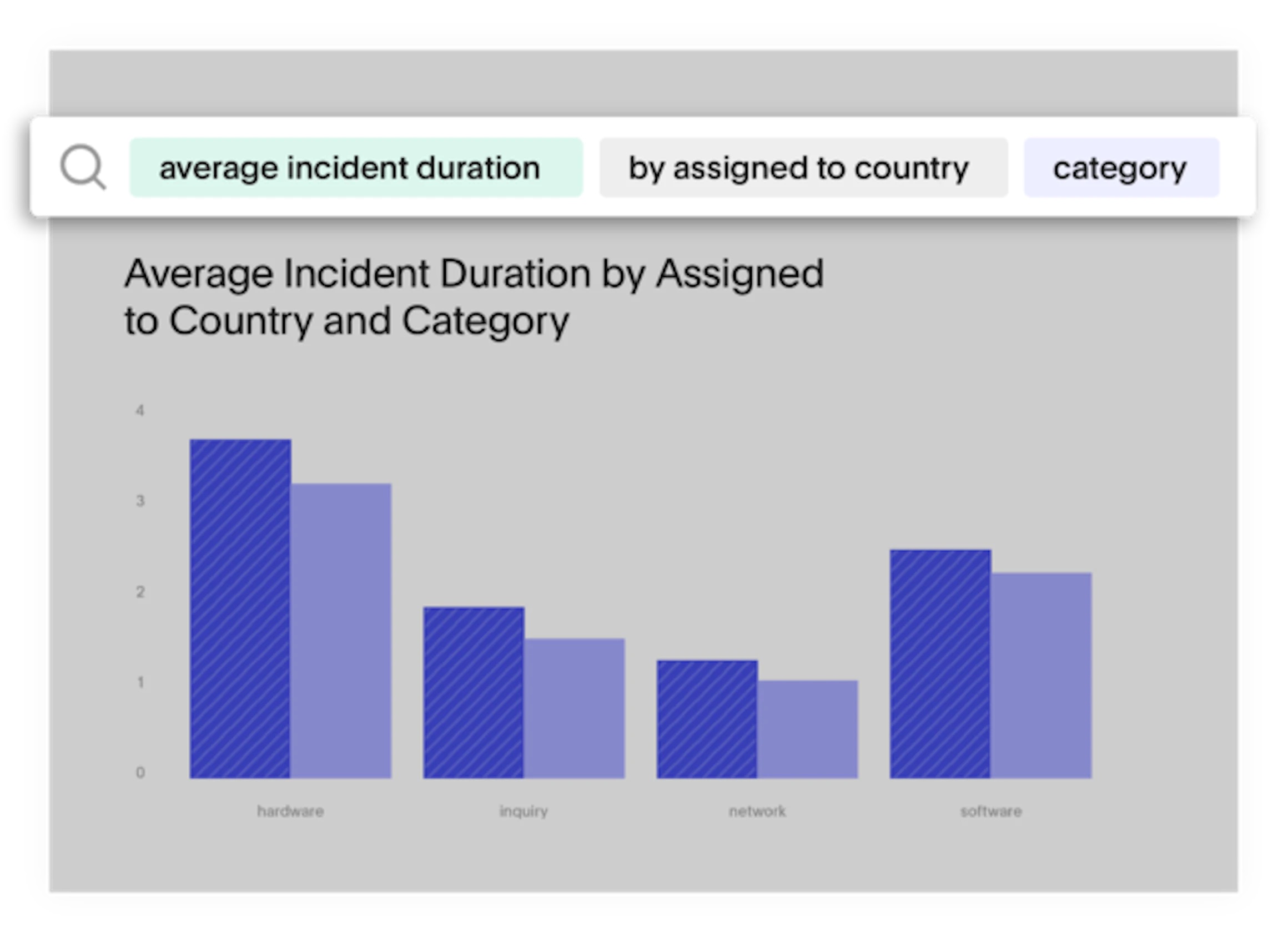
KPIs and charts: These are the stars of the dashboard. KPIs (key performance indicators) give you a high-level view of how things are going—revenue, churn, conversion rate, whatever matters most to your team. Charts like bar graphs, line charts, and pie charts bring those numbers to life and make trends easier to spot.
Filters and drill-downs: Need to see how a campaign performed in just one region? Or compare this month to last quarter? Filters let you slice the data to zoom in on what matters. Drill-downs go a step further, letting you click into a metric to explore the data behind it without SQL.
Text boxes or note tiles: A chart’s great, but context is everything. These tiles let you add commentary, flag outliers, explain how a metric is calculated, or guide your team toward the right next step. It’s like leaving a sticky note on the data, but smarter.
Interactive elements: Modern dashboards aren’t static; they’re built for exploration. You might click a data point to open a deeper view, adjust a date range with a slider, or toggle between chart types. These features turn your dashboard from a passive report into a powerful decision-making tool.
It’s not just about making data look pretty. It’s about surfacing the right data in the right way—so your team can stop guessing and start acting.
BI Dashboards excel at presenting key metrics in a dynamic, interactive way. These dashboards allow users to drill into data, adjust filters, and explore trends, making them ideal for fast-paced environments where quick, actionable insights are critical. Dashboards may update in real time (like ThoughtSpot’s AI-Augmented Dashboards) or at regular intervals (daily, weekly, etc.), depending on the data source.
On the other hand, BI Reports are static and typically represent a snapshot of data at a specific moment in time. Think of reports as polished documents you use for detailed analysis or sharing with stakeholders, like quarterly financial summaries or year-end reviews. While reports offer in-depth insights, they lack the flexibility and interactivity of dashboards.
So, when should you use each? Dashboards are perfect for fast decision-making, while reports are more suited for deep dives into data or for compliance. It’s not about choosing one over the other, but knowing when to use each tool for maximum impact.
BI dashboards go beyond simple charts. They act as a centralized hub for business insights, providing teams with the information they need, when they need it. Here are the key benefits:
1. Centralized insights
Instead of hopping between different tools, a dashboard pulls data from multiple sources into a unified view. For instance, a business dashboard might integrate data from Salesforce, Google Analytics, and HubSpot to give a complete picture of campaign performance.
2. Timely insights
Traditional dashboards help you stay updated with the latest data, whether you're tracking weekly performance or reviewing monthly trends. But digging through multiple charts or reports can slow you down. That’s where Spotter, ThoughtSpot’s AI Analyst, comes in. Instead of searching for the right visualization, you can ask a question in natural language, such as “How are sales trending this week compared to last?” and get instant, business-ready insights.
Spotter offers real-time dashboards and visualizations, so you can confidently respond to changing conditions in real time, like monitoring ad performance during a campaign launch or tracking conversions during a flash sale.
3. Improved decision-making
With key metrics displayed clearly, dashboards help teams to make informed, data-driven decisions. For example, a sales team might spot low inventory on a top product and adjust marketing efforts on the fly.
4. Enhanced collaboration
Dashboards make it easy to share insights and ensure everyone is on the same page. AI-Augmented Dashboards from ThoughtSpot take collaboration further by embedding data directly into daily workflows, allowing teams to act quickly based on fresh insights.
5. User engagement
Dashboards aren’t just for data experts. They’re designed to be intuitive and accessible to all users, from business leaders to operational teams. Interactive features like drill paths, filters, and dynamic visualizations allow anyone, regardless of their data experience, to explore data on their own terms.
Creating a BI dashboard that delivers business value requires a tailored approach for each team. Here are the key steps to follow:
Step 1: Understand stakeholder needs
Start by understanding your stakeholders' needs. Ask questions like:
Who will use this dashboard?
What key insights are they looking for?
What are their current vs. ideal workflows?
What data sources are they using now?
Will they have time to log into the dashboard, or would they benefit more from automated KPI monitoring?
What drill-down paths should be included?
What data should users have access to, and what should they not?
Step 2: Define and agree on objectives
Once you've gathered input, collaborate with stakeholders to define clear, actionable objectives for the dashboard. These objectives should be agreed upon by both the data team and end users, ensuring alignment from the start.
Step 3: Build your data pipeline
Set up your data pipeline to gather data from multiple sources, ensure it’s mapped back to business data, and ensure proper governance. The data should be accessible to the right stakeholders and ready for analysis.
Step 4: Collaborate on layout and design
Start mocking up the layout with your objectives in mind. For static dashboards like Power BI or Tableau, design is especially important. However, with ThoughtSpot, our search-based, interactive visualizations let you iterate and collaborate in real-time. You can even adjust designs during team meetings to keep everything aligned.
Step 5: Prioritize performance and accuracy
Performance and trust in your data are critical. According to a Harvard Business Review survey, 66% of respondents believe improving data quality and trust is key to increasing data value. Make sure your dashboard is fast and easy to use—this will increase adoption and help users make data-driven decisions faster.
Step 6: Tell a story with your data
Consider how your audience will use the data. Tailor the dashboard to their workflow. For example, place high-priority KPIs at the top left corner for easy visibility. Use ThoughtSpot’s note tiles to add context and instructions to visualizations, helping users better understand what they’re looking at.
Step 7: Show how to maximize value
When launching the dashboard, demonstrate its full potential to your team. If they see it in action and understand how it fits into their daily processes, they’ll be more likely to embrace it.
Step 8: Monitor and iterate post-launch
Even after launch, keep track of how the dashboard is being used. Be ready to make adjustments based on feedback, such as adding new data sources or modifying workflows. Regular check-ins with teams will ensure the dashboard evolves to meet changing needs.
Step 7. Show how to get the most value from the data and dashboard
You have to remember that your audience isn’t necessarily a data savant. Sure, most users have some level of data literacy, but it will vary in degrees depending on your audience.
When you launch a new dashboard for your team, this is your opportunity to show them the power of the dashboard you’ve built, and underline the value of using data in their day-to-day processes. If they see it in action, they are more likely to buy in and incorporate the new workstream into their current workflow.
Step 8. Monitor and iterate based on post-launch usage
Even if you follow all of these steps down to the letter, there will undoubtedly be changes to workflows, data that didn’t turn out to be useful, or new data sources that get introduced. That’s why it’s important for data teams to monitor dashboard usage and set regular check points with teams to understand areas for improvement.
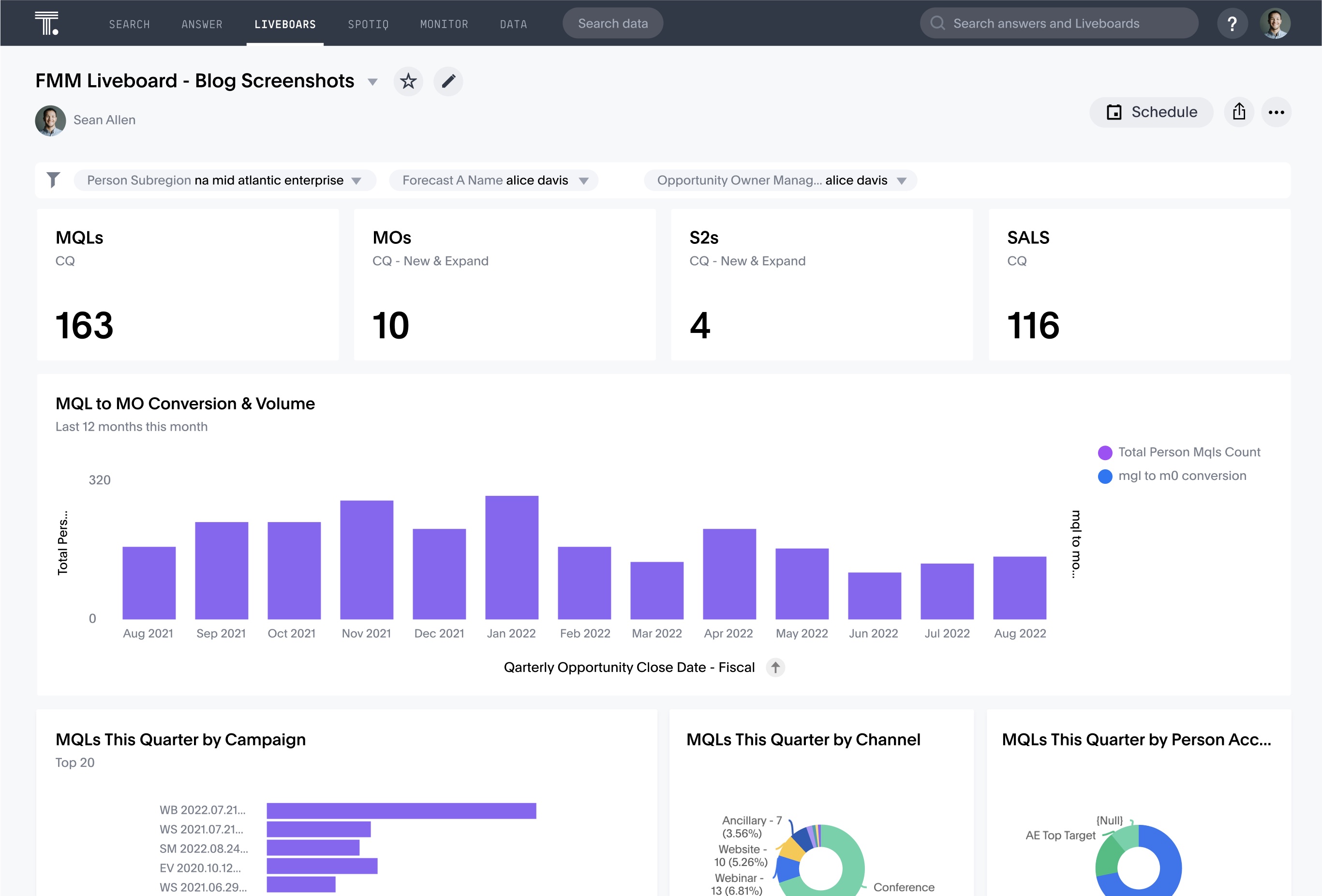
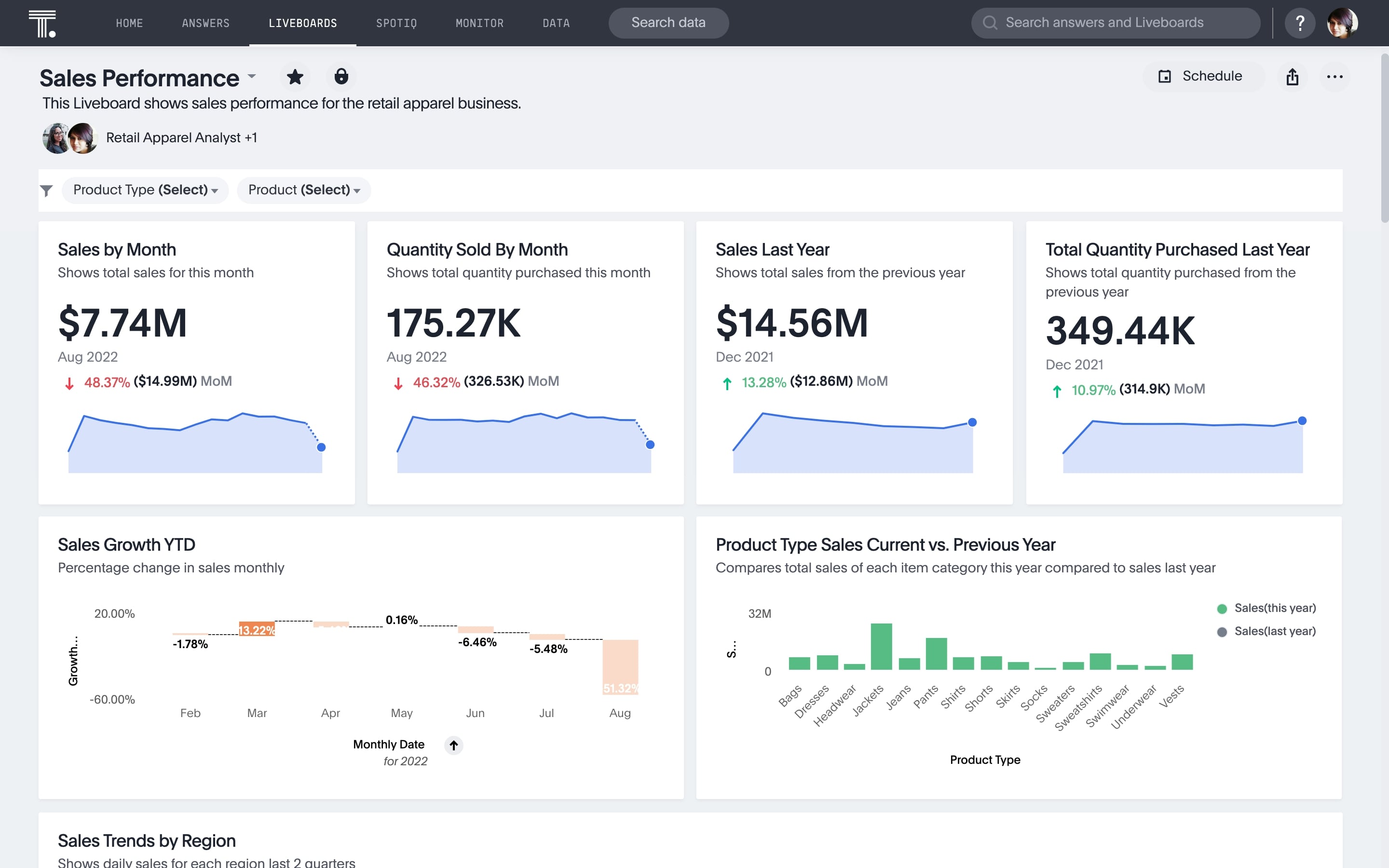
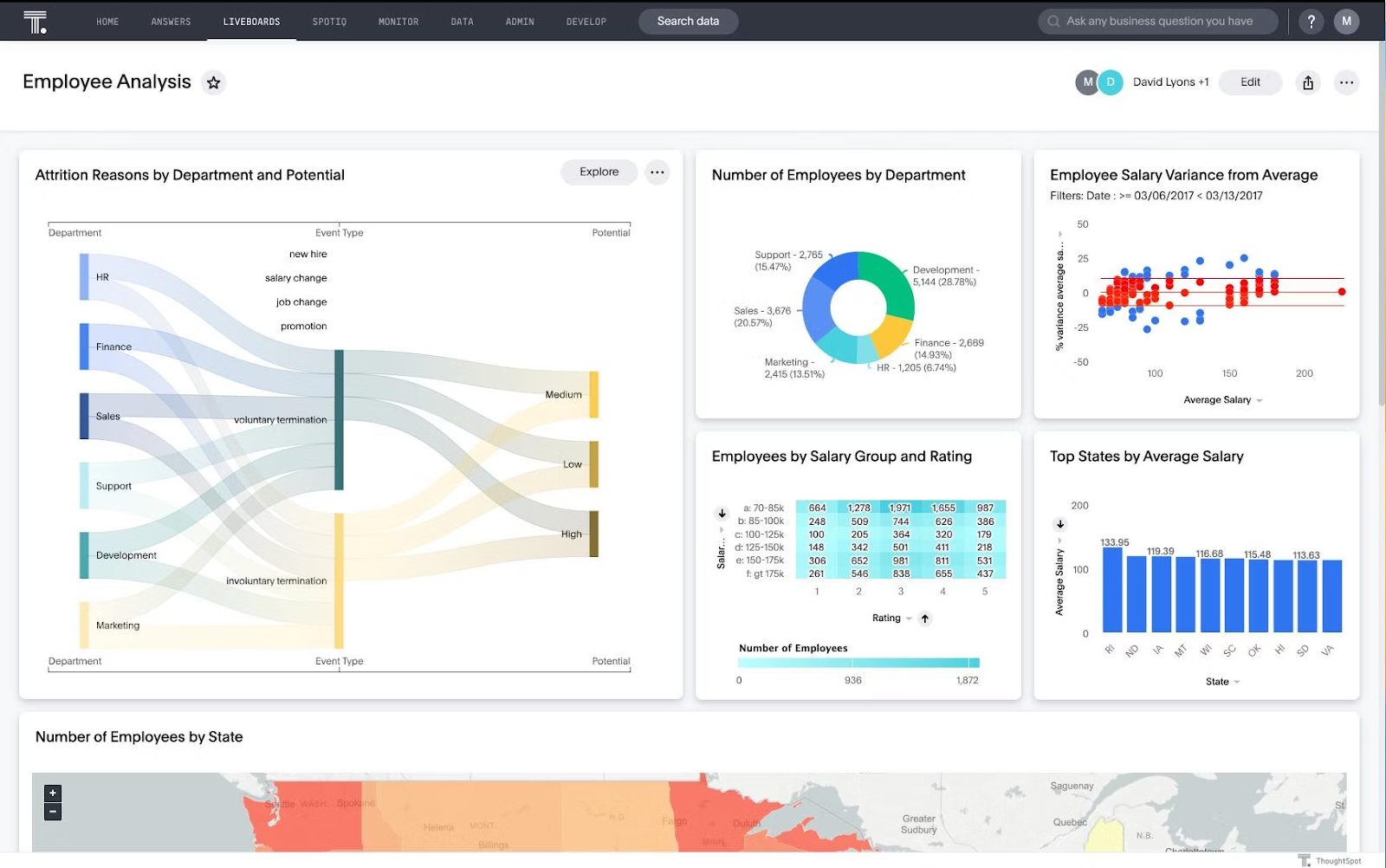
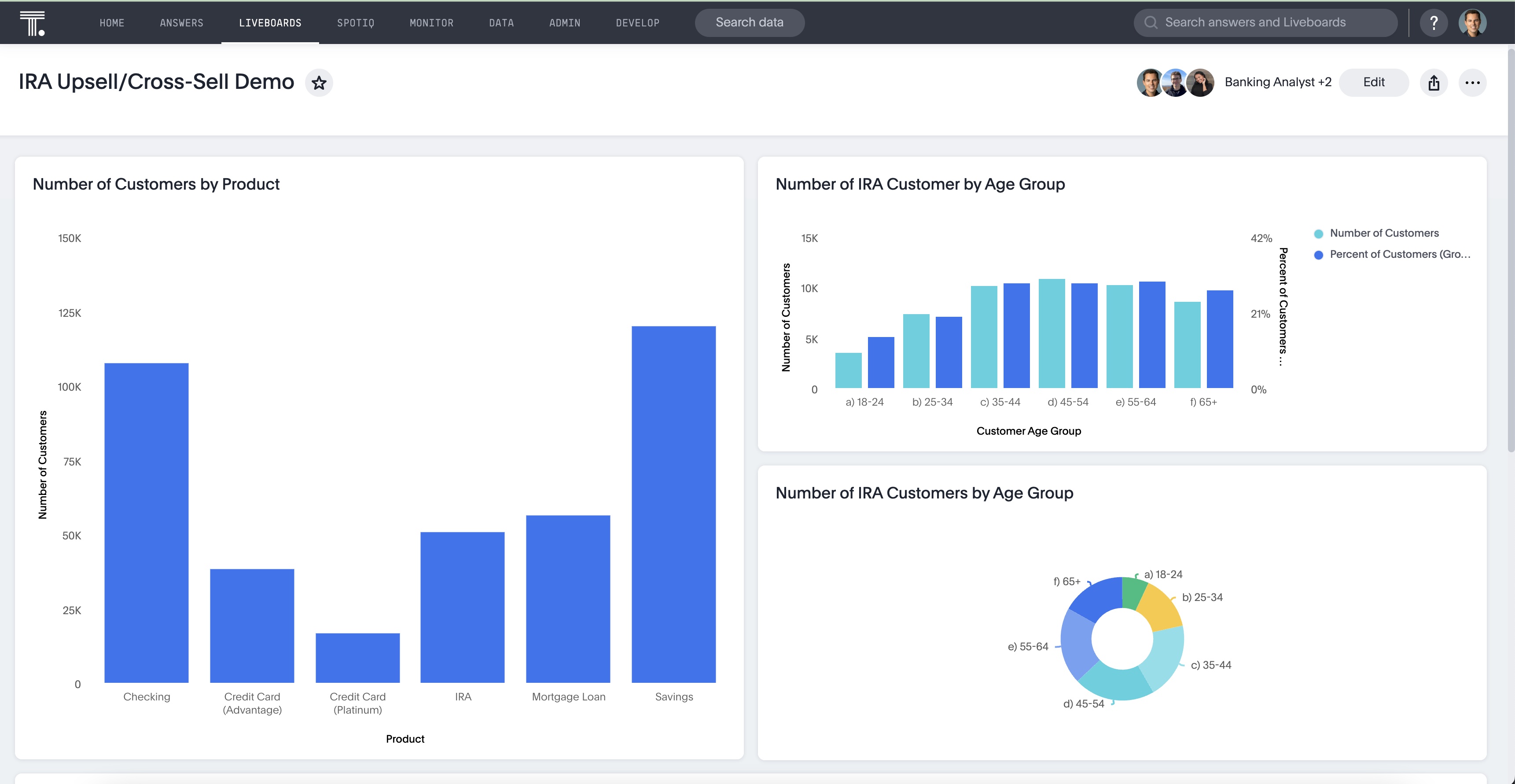
As mentioned before, every team will have different dashboard requirements. However, here are a few examples and ideas to get you started:
Marketing KPI dashboard
Marketing teams rely on a variety of data sources—from website analytics to social media metrics. A comprehensive dashboard pulls all these sources together, providing a unified view of campaign performance.
Sales dashboard
Sales teams need up-to-date, SKU-level insights. A sales dashboard should allow both high-level overviews and the ability to drill down into granular data.
More reading: See how Fabuwood decommission 50 manual reports with interactive Liveboards
HR dashboard
HR teams can monitor KPIs to reduce employee turnover and forecast team needs, helping businesses make more proactive decisions.
More reading: Discover 5 powerful ways to use people analytics in HR
Finance dashboard
Finance teams rely on data to make critical decisions. A finance dashboard should deliver the real-time insights needed to keep the business financially healthy.
More reading: Here are the top 3 data visualizations for finance professionals
Customer service dashboard
Customer service teams benefit from understanding rep availability, customer satisfaction, and handle times. A dashboard keeps these key metrics front and center.
More reading: See how managers at Wellthy use Liveboards to support their 200+ member care team
IT dashboard
IT teams need visibility into system availability, security, and access control. A well-designed IT dashboard can streamline response times and improve system performance.
More reading: Here’s how Snowflake hit 99% of IT commit goals with ThoughtSpot for ServiceNow Analytics
A BI dashboard serves as your business's control center, pulling key performance indicators and visualizations from multiple sources into one comprehensive view. It’s similar to how your smartwatch compiles health data into a single interface—only here, it’s your business data.
However, not all BI dashboard tools are created equally. As Scott Stevens, Executive Director at JP Morgan Chase, said in an episode of The Data Chief: “BI tends to have this notion of looking backwards. It's not thinking about prescriptive or predictive analytics, or live analytics, powered by the new capabilities that we're seeing.”
So you need a solution that powers real-time insights. Here are the key features to consider when selecting a BI dashboard tool:
1. Customizable and interactive interface
The ability to personalize your BI dashboard is one of its biggest advantages. Unlike static reports, dashboards offer flexibility to adjust the layout and choose the KPIs that matter most.
With ThoughtSpot’s AI-augmented dashboards, you can interact with your data in real time, ensuring that your dashboard aligns with your team’s specific needs. Whether you're focused on sales, marketing, or operations, you can tailor the Liveboard to deliver the insights you need quickly and in the format that works best for your team.
2. Data source connections
For a BI dashboard to be effective, it needs seamless access to your data. Dashboards should integrate with a variety of data sources, like data lakes, warehouses, or marts. ThoughtSpot excels here with native connectors to cloud platforms like Google BigQuery and Snowflake, allowing you to consolidate data from multiple sources into a unified view. This helps ensure that you have a comprehensive understanding of your business performance, all in one place.
3. Drill-down capabilities
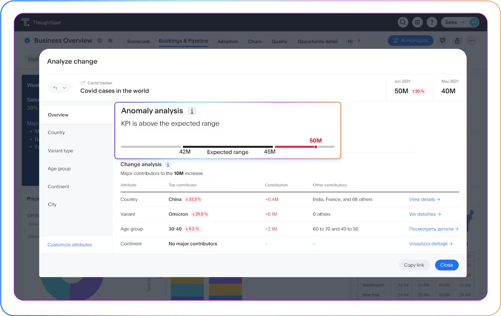
Surface-level insights often aren’t enough when making data-driven decisions. You need the ability to dig deeper. Drill-down capabilities allow you to access more detailed data by clicking on specific data points. ThoughtSpot’s AI-powered search and analytics let you drill into data hierarchies easily, providing both deeper insights and context.
4. AI-powered augmented insights
Traditional dashboards can display raw data, but AI-powered augmented insights take things to the next level. These insights provide deeper context, automate recommendations, and even predict future trends. With Spotter, ThoughtSpot’s agentic AI, you not only get deeper data layers but also actionable recommendations tailored to your business needs.
5. Sharing capability
Collaboration is key to making the most of your BI dashboard. BI tools should have robust sharing features that allow you to distribute dashboards effortlessly, ensuring your team stays aligned on data-driven decisions. Whether you’re exporting reports, sharing links, or embedding visualizations, sharing capabilities make it easy to keep everyone on the same page. With ThoughtSpot Liveboards, you can present real-time data in presentations through the Present mode, automatically integrating live updates and ensuring your team has access to the latest insights at all times.
BI dashboards are more than just tools for displaying data—they’re essential for driving fast, informed decisions and building a data-driven culture. But presenting data alone isn’t enough; dashboards need to help users understand and act on the insights immediately. That’s where ThoughtSpot stands out.
With ThoughtSpot AI-driven search capabilities transform raw data into meaningful insights in real time, enabling quick decisions that matter. These dashboards empower teams to make informed choices faster, improving overall business agility.
See how next-generation can elevate your decision-making—schedule a live demo today.


