


Ever stared at a dashboard and thought, “What am I actually looking at?”
You’re not alone. Dashboards were supposed to make data easier to understand, but most end up buried in charts, filters, and KPIs that no one really knows how to use.
And now that agent-powered analytics and AI tools are changing how we explore data, the old definition of a dashboard doesn’t quite fit. It’s not just a static report anymore: it’s a live workspace where you can ask questions, test ideas, and move from insight to action in real time.
So, what is a dashboard, and what makes a good one actually useful? Let’s break it down.
Table of contents:
A dashboard is a visual interface that brings together key data points, metrics, and trends in one place.
The goal?
To give you a clear, at-a-glance view of what’s going on so you can track performance, spot issues early, and make smarter, faster decisions.
Dashboards usually pull data from various sources like your CRM, data warehouse, ERP, or marketing platforms, and present it using visuals like bar charts, line graphs, tables, heatmaps, gauges, or KPIs.
For example, say you’re a retail manager tracking weekly sales. Your dashboard shows a sudden dip in revenue. That’s your “what.”
But with the right filters and drill-downs, you can quickly see the “why”, like a regional store underperformed or foot traffic dropped after a local event was canceled.
But here’s the catch. Most BI tools stop there; they show you the “what” but don’t make it easy to explore the “why.” You’re left clicking through complicated menus, juggling multiple reports, or waiting on analysts just to get basic answers.
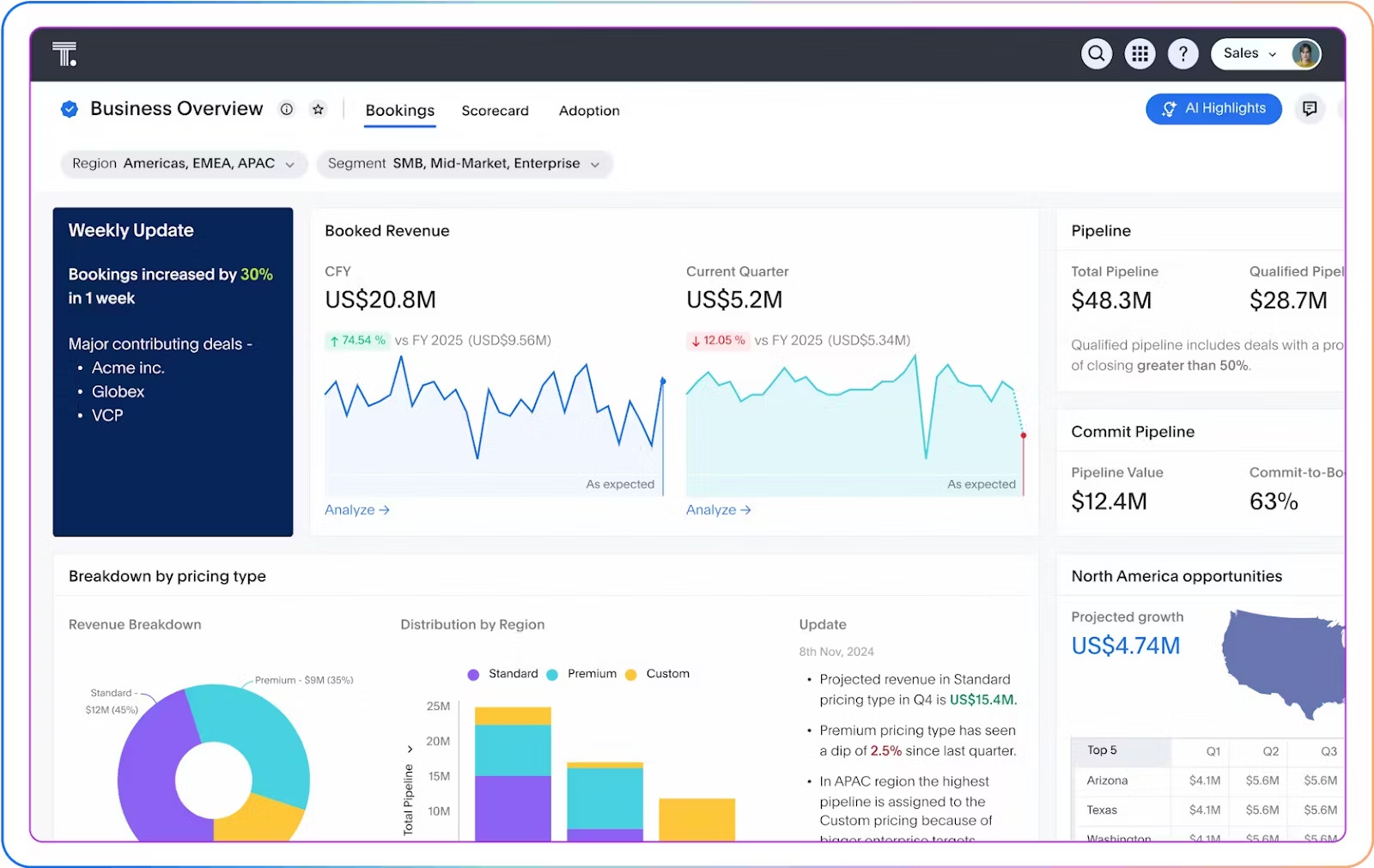
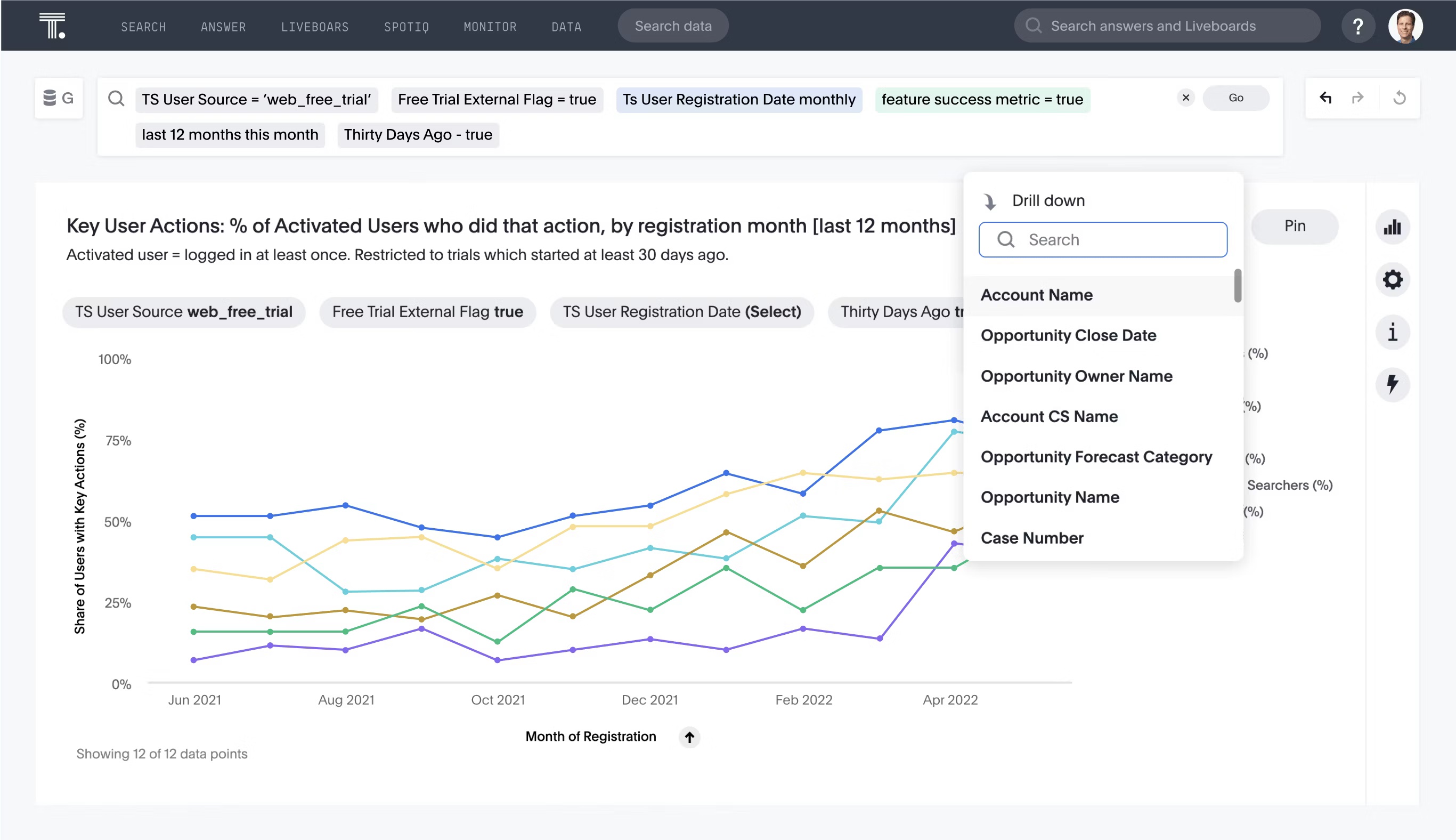
ThoughtSpot takes a different approach. Instead of static dashboards, it offers AI-augmented Dashboards where you can simply ask questions in natural language, like “Why did revenue drop last week?” and get instant, detailed answers. You can also ask new questions on the fly, and take action—all in the same flow.
A dashboard isn’t valuable just because it looks nice. It earns its place by helping you and your team make smarter, data-driven decisions faster, often by leveraging augmented analytics to provide deeper insights.
Here’s what makes a dashboard worth using:
Makes your data easier to understand
A real-time dashboard takes raw numbers and turns them into something you can actually read at a glance. Whether it’s a line chart showing revenue growth or a simple gauge for daily active users, it helps you instantly get a sense of where things stand.
This often relies on solid data modeling behind the scenes, organizing and structuring data so the dashboard can deliver clear, actionable visuals.
Keeps your priorities front and center
You don’t need to see everything, just the right things. A strong dashboard highlights the key metrics and KPIs that matter most to your role or goals. That might be sales performance tracked on a sales dashboard, customer retention, campaign results, or something else entirely.
The point is you get to focus on what moves the needle.
Helps you spot issues before they grow
Dashboards use interactive data visualizations to help you see patterns over time, catch sudden spikes or dips, and notice when something’s off. Maybe churn jumped after a product update, or ad spend went up, but conversions stayed flat.
By tapping into the power of data analytics, dashboards help you catch issues before they spiral and identify opportunities that might otherwise get lost in the noise.
Creates a shared view for your team
When everyone is working from the same dashboard and the same data, conversations become more grounded. Strong data governance plays a key role here, making sure the data is accurate, consistent, and secure so everyone trusts what they’re seeing.
You spend less time debating what the numbers are and more time deciding what to do about them. That alignment leads to better, faster decisions across the board.
Traditional BI dashboards were designed for static dashboard reporting. Analysts built them, business users consumed them, and updates meant waiting in line for changes. They gave you answers to questions you already knew to ask, and if your follow-up question didn’t fit the dashboard’s structure, you were out of luck.
Modern dashboards, especially those powered by agents, flip that model. Instead of just displaying metrics, they act as intelligent interfaces that support dynamic search, generate new insights based on behavior or business context, and adapt as the data and your business evolve.
Agent-powered dashboards like ThoughtSpot Liveboards go beyond fixed charts. You can ask follow-up questions in plain language, spot changes in real time, and take action directly from the dashboard, without looping in a data team every time your priorities shift.
Here’s a quick comparison:
| Feature | Traditional Dashboards | Agent-Powered Dashboards |
|---|---|---|
| Static or real-time? | Mostly static | Dynamic and real-time |
| Built by? | Analysts | Business users + analysts |
| Interactivity | Limited | Highly interactive (search, drill-downs, etc.) |
| Follow-up questions | Require new builds | Answered in-platform |
| Context-awareness | Low | High. Can surface relevant insights automatically |
| Built for action? | Not really | Yes. Actions are built in |
Not all dashboards are created equal, but most great ones share a few key building blocks. Here's what you'll typically find in a modern, well-designed dashboard:
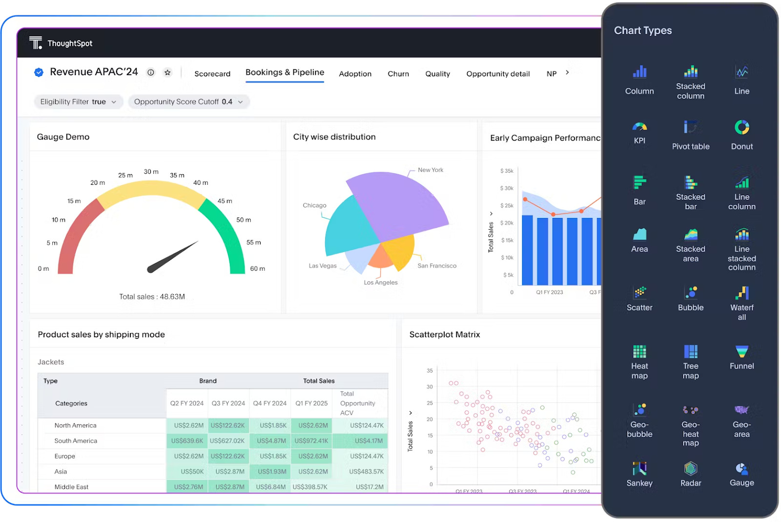
Visualizations
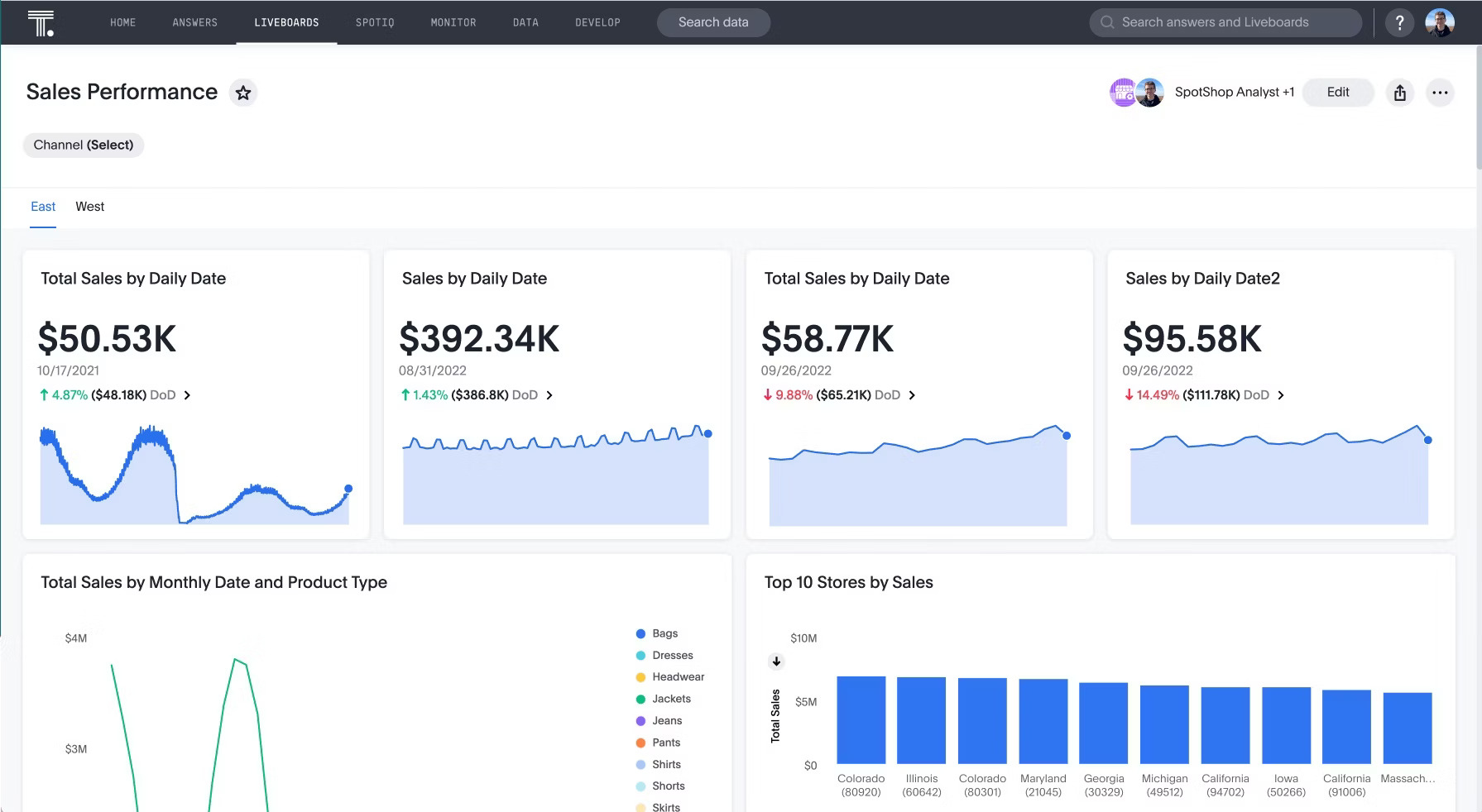
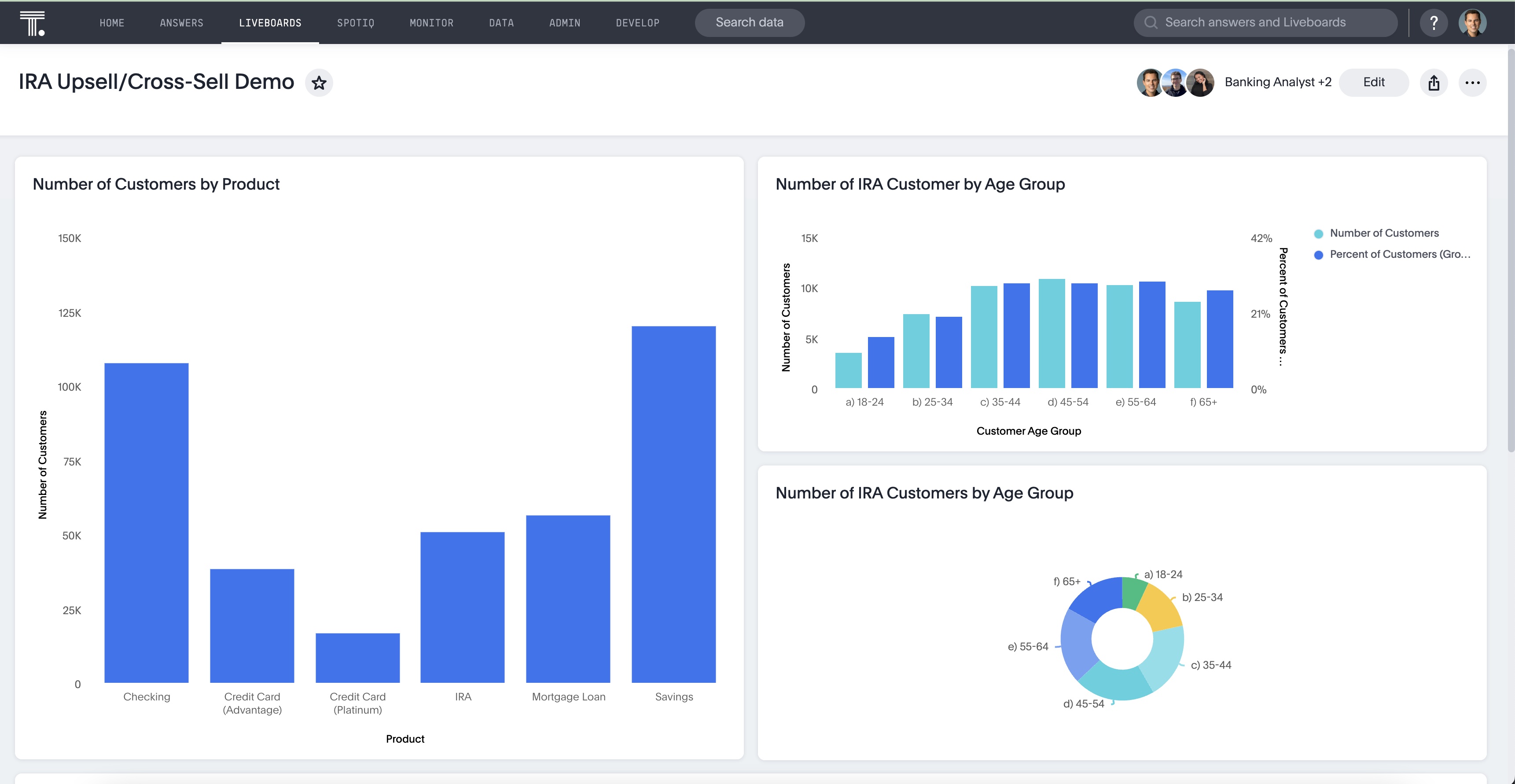
Charts and graphs bring the data to life. Line charts show trends, bar and pie charts compare values, scatter plots highlight relationships, and tables display exact numbers, making patterns easier to spot.
In ThoughtSpot Liveboards, you can easily swap between data visualization types or layer multiple views to give deeper insight without needing to rebuild the dashboard from scratch.
Metrics and KPIs
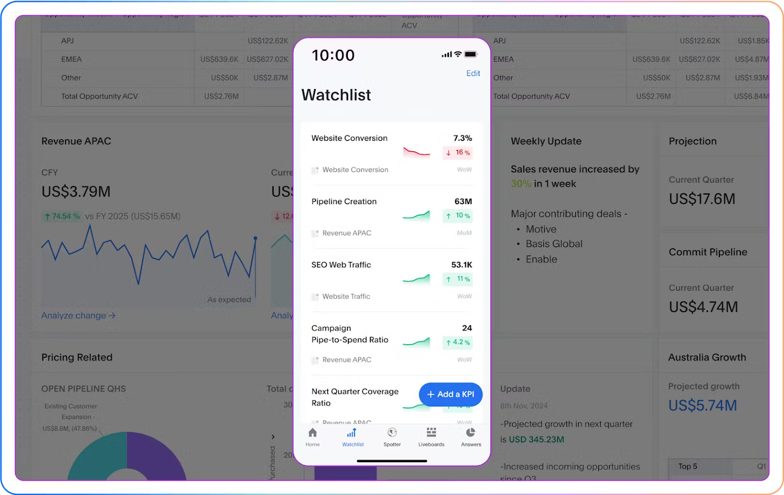
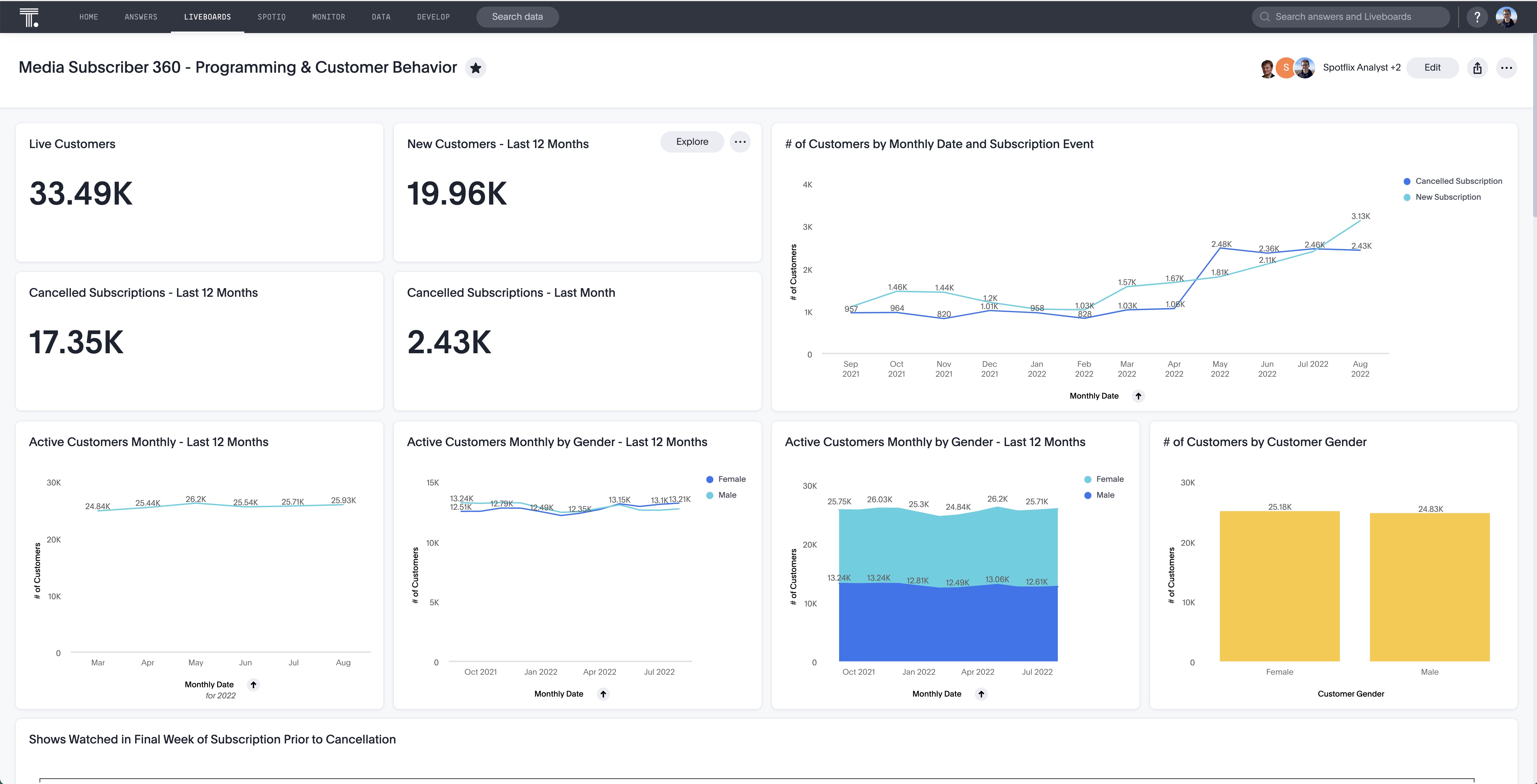
These are the numbers that matter most to your business, like monthly recurring revenue (MRR), website traffic, conversion rates, inventory levels, or customer retention. Dashboards surface these key metrics so teams can stay aligned and track progress in real time.
In ThoughtSpot, you can pin important metrics to a personalized Watchlist, set up automatic or custom alerts, and keep tabs on performance with fresh data at your fingertips.
Filters and controls
Dashboards should be interactive, not static. With filters and controls like dropdowns, sliders, or toggles, users can adjust the view based on what they care about—whether that’s a specific region, timeframe, customer segment, or product line. This lets people explore the data without needing a custom report.
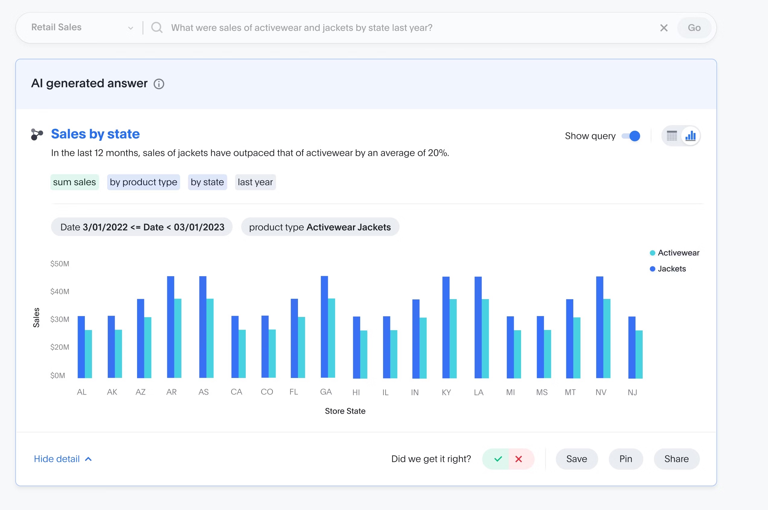
ThoughtSpot lets you filter, drill down, and even ask follow-up questions in natural language, no SQL required. Spotter, your AI analyst, understands your business questions and delivers answers instantly, helping you analyze data by simply asking instead of manually adjusting filters.
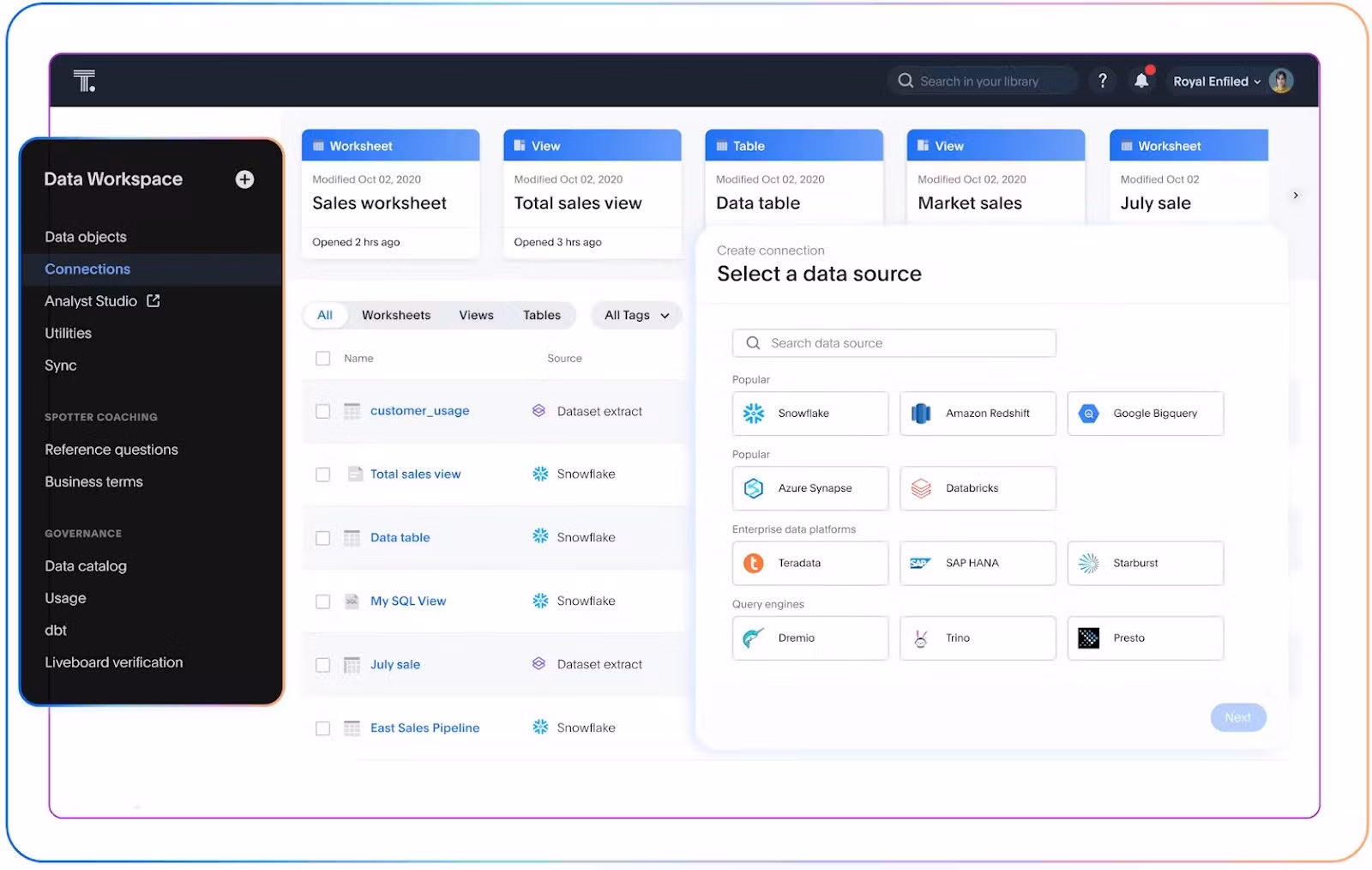
Live data connections
Dashboards are most useful when they reflect current data. By connecting directly to sources like Snowflake, Salesforce, or Google Analytics, live dashboards can update automatically either in real time or on a set schedule, so you’re always working with the latest numbers.
ThoughtSpot connects natively to your cloud data platform so Liveboards update instantly, without ETL pipelines or stale extracts.
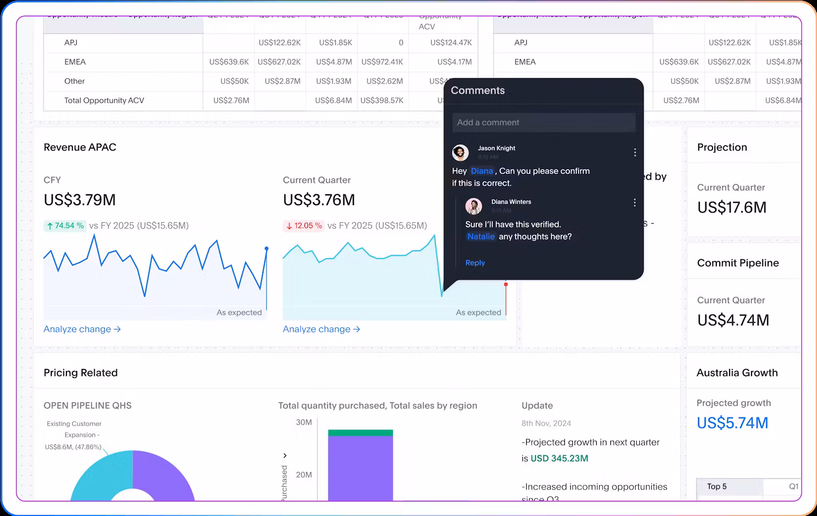
Annotations and context
Even the clearest chart can raise questions. Why did revenue spike last week? What changed in user behavior? Adding notes, commentary, or links to supporting information helps explain what’s going on. That extra context turns dashboards from a collection of charts into a tool for real decision-making.
ThoughtSpot lets you add note tiles for context, comment directly on dashboards to ask questions and share insights, present in meetings, or embed in Google Slides. Plus, you can stay in the loop with alerts sent through Slack, Teams, or email, making it easy for everyone to collaborate and act on data together.
Building a dashboard that actually gets used and drives decisions takes more than organizing data on a page. It needs to tell a data story and point to next steps.
Step 1: Start with the questions
Begin by understanding the key questions your audience needs answered. What decisions do they make? What metrics truly matter? Build your dashboard around those questions, not just the data you have lying around.
Step 2: Focus on clarity and simplicity
Avoid dashboard overload. Limit the number of visual elements to what’s essential. Use clean layouts, clear labels, and intuitive visuals that make it easy to understand the story at a glance.
Step 3: Make it interactive
Give users the ability to filter, drill down, and explore the data on their own. Interactivity turns a static snapshot into a dynamic tool for discovery.
Step 4: Use real-time or near-real-time data
Fresh data means timely decisions. Connect your dashboard to live data sources so your users can trust that what they see reflects the current state of the business.
Step 5: Enable natural language search
Let your users ask questions in plain English. This breaks down barriers for non-technical users and speeds up insights without waiting on analysts.
Step 6: Build in alerts and notifications
Keep users informed about important changes or anomalies through alerts via email, Slack, or other collaboration tools. This helps teams act quickly without constantly monitoring dashboards.
Step 7: Foster collaboration
Add features like comments, shared notes, and presentation modes so teams can discuss insights directly within the dashboard environment. Collaboration keeps everyone aligned and focused on what matters.
Step 8: Test and iterate
Roll out your dashboard to a small group first, gather feedback, and refine it. Dashboards evolve over time as business needs and user expectations change, so keep improving.
Dashboards serve different purposes depending on who’s using them and what they need to know. Here’s how different business dashboards match up with different roles.
1. Operational dashboards
Operational dashboards focus on day-to-day activities and immediate performance, delivering real-time operational insights to help teams react quickly and keep processes running smoothly.
For example, a customer support team may monitor ticket volumes and resolution times, or a warehouse manager tracks order fulfillment status. Operational dashboards prioritize clarity and simplicity, showing key metrics clearly so anyone can understand them fast.
Used by: Customer support, operations, IT, logistics teams
Typical KPIs: Ticket resolution time, daily sales volume, system uptime, order fulfillment rate
Common challenges: Can become cluttered if too much data is shown; users may get overwhelmed without a clear focus on the most critical metrics.
2. Strategic dashboards
Strategic dashboards provide executives with a high-level overview of progress toward long-term business objectives. They track big-picture metrics like revenue growth, customer retention, and market share. These dashboards help leaders make informed decisions about where to allocate resources and adjust strategy.
Used by: C-suite, VPs, directors
Typical KPIs: Revenue growth rate, net promoter score (NPS), customer churn, market share
Common challenges: May lack granularity for day-to-day decisions; risk of becoming a “vanity” dashboard that looks good but doesn’t drive action.
3. Analytical dashboards
Analytical dashboards are designed for deep dives into data. Analysts use them to explore trends, identify patterns, and test hypotheses through filters, drill-downs, and custom queries. These dashboards offer flexibility to slice and dice data from multiple angles, supporting complex investigations.
Used by: Data analysts, BI teams, and power users
Typical KPIs: Conversion rates by segment, customer lifetime value, correlation coefficients, data quality metrics
Common challenges: Complexity can intimidate business users; the risk of “analysis paralysis” if too many options confuse decision-making.
4. Tactical dashboards
Tactical dashboards sit between operational and strategic dashboards. They help mid-level managers track performance against short- to mid-term goals, such as monthly sales targets or campaign performance. Tactical dashboards balance detail with summary, offering actionable insights to guide team efforts and course corrections.
Used by: Team leads, project managers, department heads
Typical KPIs: Monthly sales, campaign ROI, employee productivity, inventory turnover
Common challenges: Need to balance enough detail to act on but avoid overwhelming users; must align with both operational realities and strategic goals.
5. Customer dashboards
Customer dashboards focus on metrics that show customer behavior and satisfaction, leveraging customer analytics to track engagement, support interactions, retention rates, and feedback scores. They help teams understand and improve customer experience.
Used by: Customer success teams, marketing, sales, product managers
Typical KPIs: Customer satisfaction (CSAT), net promoter score (NPS), churn rate, active users, average response time
Common challenges: Customer data often comes from multiple sources and can be fragmented; dashboards need to unify and contextualize data clearly.
6. Financial dashboards
Financial dashboards keep an eye on the company’s financial health. They track KPIs like revenue, expenses, profit margins, cash flow, and budgeting, giving finance teams and executives a clear view of how money is being spent.
Used by: Finance teams, CFOs, executives
Typical KPIs: Revenue, gross margin, operating expenses, cash flow, budget variance
Common challenges: Requires accuracy and up-to-date data; mistakes or delays in financial data can lead to poor decision-making.
7. Supply chain dashboards
Supply chain dashboards monitor the flow of goods and materials across production, inventory, and delivery. These dashboards track order statuses, shipment times, inventory levels, and supplier performance to keep supply chain operations efficient and avoid bottlenecks.
Used by: Supply chain managers, logistics teams, procurement
Typical KPIs: Inventory turnover, delivery times, order accuracy, supplier lead time
Common challenges: Supply chain data can be complex and spread across multiple systems; dashboards must integrate these sources seamlessly for a real-time view.
At first glance, dashboards and reports might seem pretty similar, both display data and insights. But they actually serve different roles and are designed with different goals in mind.
Dashboards focus on real-time monitoring and quick decision-making. They’re highly visual and interactive, letting you explore data on the fly. Think of a dashboard as your command center, giving you a snapshot of how things are going at a glance.
Reports, on the other hand, are often more detailed and text-heavy. They provide deep analysis or periodic summaries, like a monthly sales report or a quarterly performance review. Reports tend to be static and are usually distributed on a schedule, serving as a reference rather than a live tool.
| Feature | Dashboard | Report |
|---|---|---|
| Purpose | Real-time monitoring and decision-making | In-depth analysis or periodic summaries |
| Format | Visual, interactive | Text-heavy, often static |
| Audience | Ongoing use by teams or individuals | One-time or recurring distribution |
| Interactivity | High | Low (typically read-only) |
Dashboards are still foundational. But the role they play is shifting from something you reference occasionally to something you interact with every day. When done well, a dashboard doesn’t just report, it guides.
With ThoughtSpot, dashboards become conversations powered by agents like Spotter. Instead of staring at static charts, you can ask follow-up questions in natural language, drill into what changed and why, and get AI-assisted answers that move decisions forward—without waiting on a data team.
See how agent-powered dashboards can help your team move faster, ask better questions, and take action—book a demo today.
FAQs
Why is real-time data important in a dashboard?
Real-time data lets teams respond faster. When you’re working with the freshest information, you can catch problems early, take advantage of opportunities quickly, and avoid making decisions based on outdated numbers.
What is an agent-powered dashboard?
An agent-powered dashboard, like ThoughtSpot Liveboards with Spotter, goes beyond displaying static charts. You can interact with it using natural language, get AI-assisted answers, drill down into data, and even take actions all from the dashboard itself.
How does augmented analytics improve dashboards?
Augmented analytics uses AI to automate data prep, surface insights, and help users explore data more easily. In dashboards, this means you’re not stuck with static charts—you can interact with the data, uncover patterns, and get AI-generated explanations or suggestions that guide smarter decisions.


